Title here
Summary here
I usually start developing a concept with the functional layout and a single selected element that resonates with the clients’ vision of their dream interior and inspires me enough to build the rest of the space around it. In the case of this apartment, it was the wallpapers.
The clients knew exactly what they wanted and how it should look, but they struggled to communicate with their previous design studio, whose services they eventually discontinued. The only aspect they had finalized was the selection of wallpapers that captured their hearts.
Interior designer Katarzyna Szantyr-Blaim, with whom we collaborated on the arrangement and supervision, helped the clients choose the wallpaper designs.
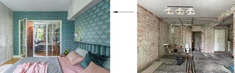
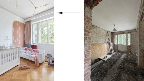
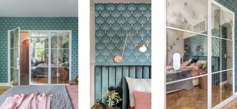
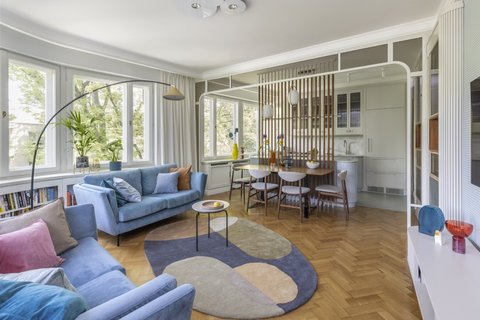
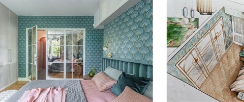
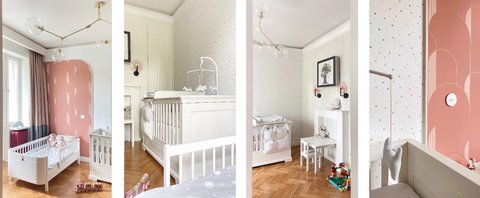
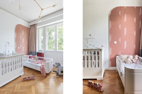
The wallpapers seen in the photos of the bedroom, living room, children’s room, and hallway were predetermined elements from the outset.
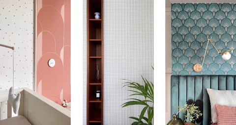
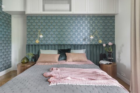
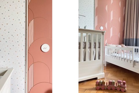
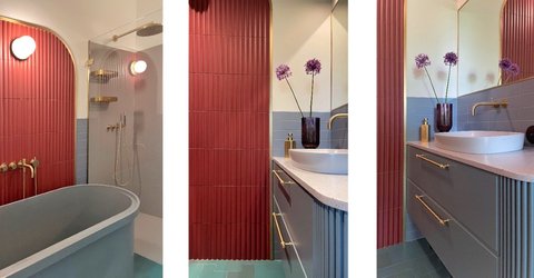
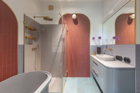
The colors and patterns of these wallpapers, inspired by the Art Deco style, became the foundation for this project’s concept.
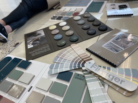
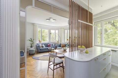
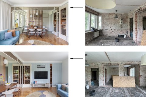
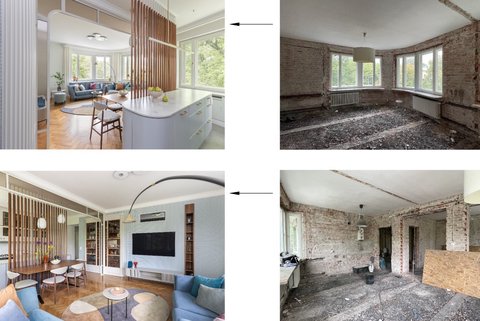
The first concept folder presented to the clientsTerrazzo and reclaimed oak parquet were intended as the primary flooring materials. While we managed to salvage the parquet, pouring terrazzo was impossible due to the small floor area and cost. Terrazzo tiles were not an option, as the clients disliked grout lines and pattern interruptions.
I decided to completely change the material, opting for a calm, timeless, and highly practical large-format gray tiles, especially considering the presence of children. Once again, my belief that limitations foster creativity proved true. It wasn’t the first time that an obstacle led to a change that ultimately resulted in a solution as good as, or even better than, the original vision.
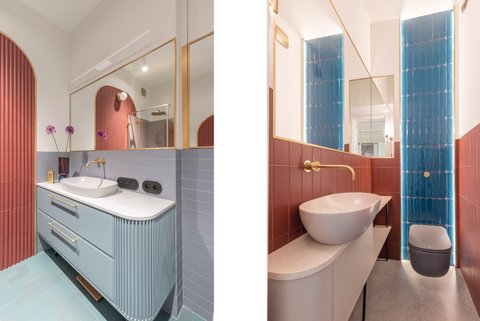
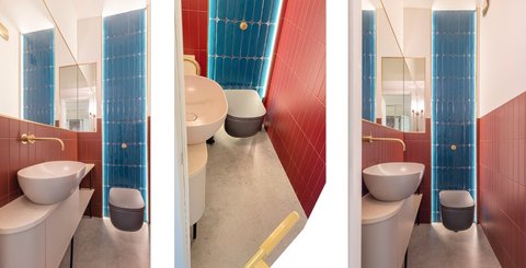
Choosing the remaining materials took time and came with its challenges. Some of the unconventional ceramic color choices were difficult to evaluate, even from samples. Additionally, some selected colors were discontinued after the clients had made their final decisions.
In the end, we achieved the effect I aimed for—blending dominant colors across rooms, varying the tones and intensities of the same hues, and referencing the initially chosen wallpapers.
During the woodwork phase, lacquer and countertop colors were added to the mix. The clients were drawn to bold colors, but I managed to convince them to opt for more subdued yet still daring choices.
Working in an old tenement building comes with its own set of challenges.
I always provide very detailed guidelines for contractors, anticipating issues related to material specifics, unfamiliar work crews, and logistics.
While uneven walls are expected, in this case, the ceiling had a 4 cm slope across the room’s width. Even with moldings and cornices, disguising this was difficult. We managed to hide some imperfections, but it was more sculpting than designing—so full credit to the carpenters and plasterers.
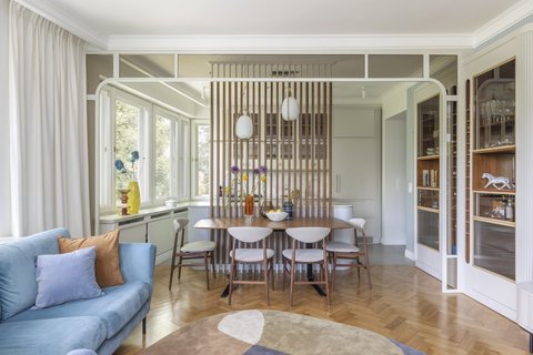
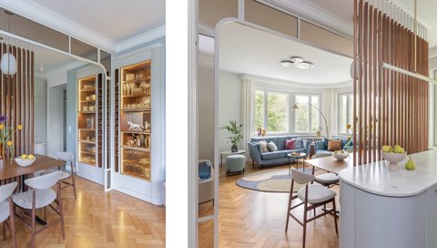
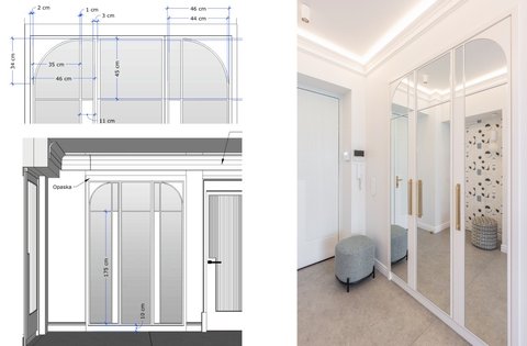
One of the first elements I envisioned for this interior was a mirrored wall with decorative muntins. Inspired by the same aesthetic, I designed the wardrobe fronts in the hallway. These are some of the elements I am most satisfied with in this space.
The antique mirrored wall in the bedroom hides the entrance to the bathroom. The aged mirror reflects natural light from the large windows, visually extending the bedroom’s space. The patina effect creates an intriguing illusion, softening reflections and enriching colors and patterns with elegance.
Mirrors in the hallway visually expand the narrow corridor.
Moldings are one of my favorite design elements. Here, we incorporated a lot of hidden lighting within them, creating a spectacular effect, especially at dusk. The most interesting features for me were the custom tile edge moldings and the stunning minimalist hardware.
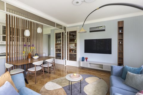
To maximize storage, many cabinets, doors, and technical elements (e.g., air conditioners) were concealed behind handleless fronts, wall-recessed doors, and cover panels.
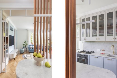
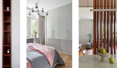
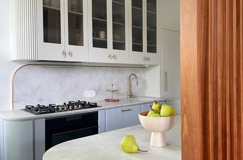
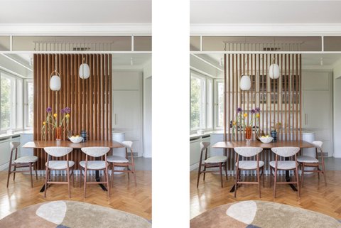
Curved details, fluted glass, copper finishes, and backlighting appear throughout the custom woodwork.
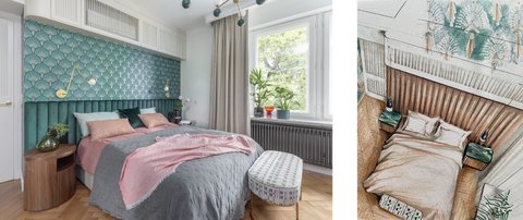
The furniture in this apartment was meticulously selected, minimalist, and of high quality. We chose most of the light fixtures well in advance due to their decorative impact (such as those in the bedroom, kitchen, and children’s room). Their aesthetics were crucial, but equally important was the color temperature of the lighting. We selected the bulbs on-site to achieve the best final effect.
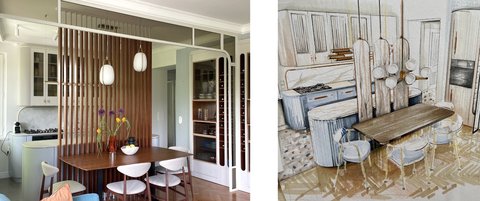
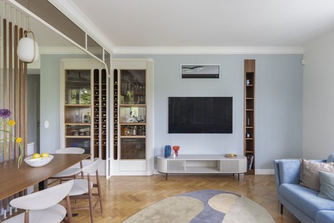
For this project, I created illustrations to depict my key ideas for arranging the living room and kitchen. The clients wanted the kitchen to be visually separated from the rest of the room and to have a way to conceal any countertop clutter. The previous designers’ solutions had completely missed the mark.
I don’t always use sketches for project presentations. More often, I showcase them as 3D models and visualizations.
The concept for this apartment took a month to develop, but the finishing work lasted over a year. Authorial supervision was the most challenging and demanding phase. Since the clients did not use my regular contractors, I met the renovation team, carpenters, glaziers, and plasterers during the process.
There was no budget estimate for this project. The clients independently decided which furnishings aligned with their financial plan.
This was an exhausting yet rewarding project, and the results turned out exactly as I had envisioned.
Photos of this project were featured in the April 2024 issue of Czas na Wnętrze magazine.