Title here
Summary here
I rarely go so far back when presenting my projects, but this one feels exceptional. It was created in 2010, and a year later, a publication featuring photos of these interiors was released.
The client approached us to design the interiors of an apartment in a building on Sułkowicka Street in Warsaw, in the lower Mokotów district. The project was carried out in collaboration with my then-partner, Sylwia Roszczyk. The shape of the Belvedere Residence building, designed by the Tadeusz Szumielewicz studio, shows inspiration from the Art Nouveau style and the decorative trend in early 20th-century architecture.
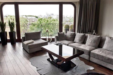
The rounded balconies, decorative railings, and window shapes create a very original atmosphere, which can also be felt in the interiors of this apartment building.
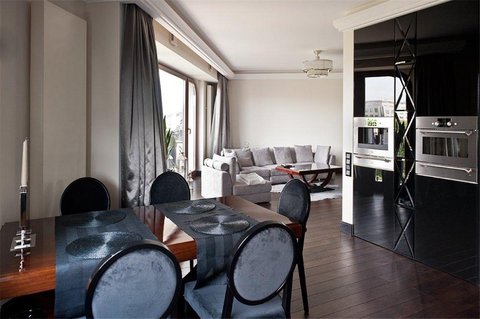
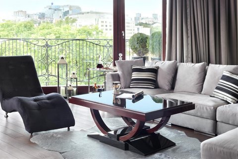
The client came with very clear expectations, and there was no doubt about the style in which she wanted to arrange her apartment. Interiors in the Art Deco style can take different directions based on color schemes, materials, shapes, specific furniture models, and patterns. The owner of this apartment aimed for luxurious, elegant, and striking solutions.
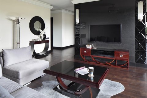
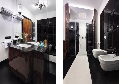
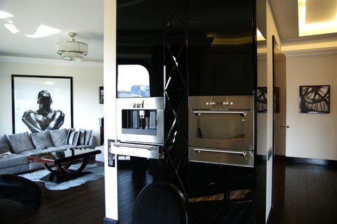
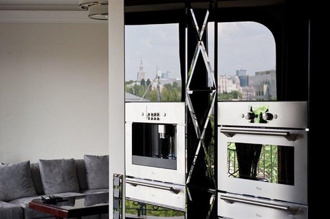
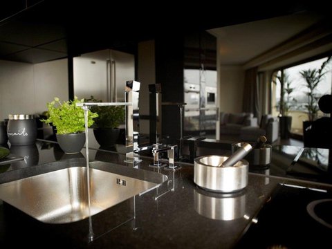
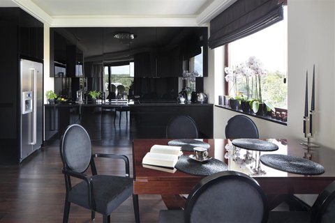
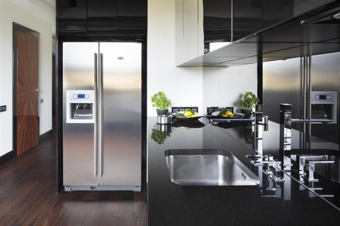
My concept for this interior stemmed from the forms of cut glass, high-gloss veneers, nickel-plated finishes, and black accents.
An additional challenge in this project was modifying the functional layout and adapting it to meet the needs of an independent woman who knew what she wanted and how she wanted to use her new space.
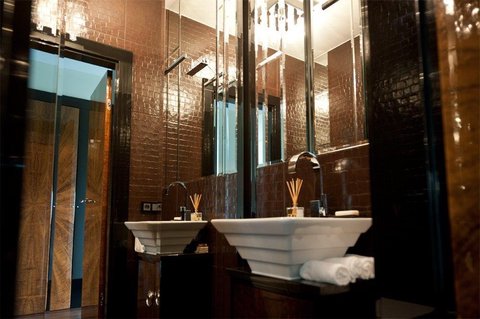
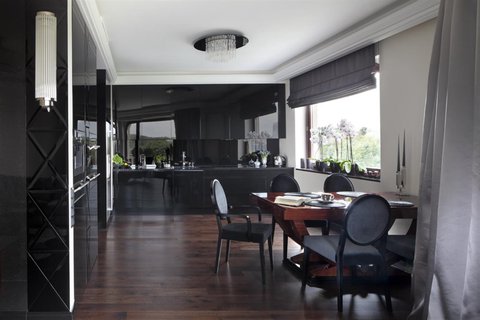
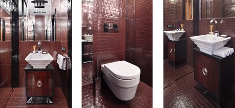
The finishing materials were based on a limited color palette and specific finishes. The first choice was a beautiful smoked wooden plank for the flooring and tiles from Maciej Zień’s collection for the bathrooms.
All of this created a very cohesive and elegant foundation.
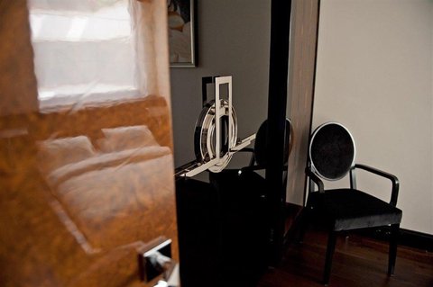
The construction team received standard guidelines, but details such as moldings, interior doors, mirrors, and even wallpapers were crafted by companies specializing in such work.
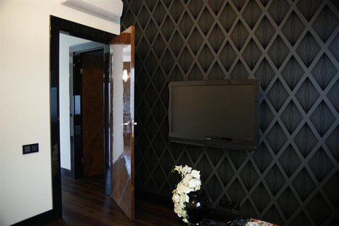
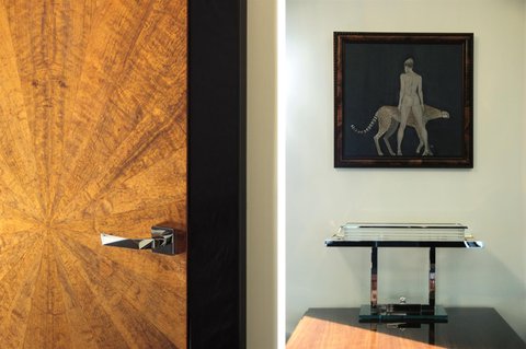
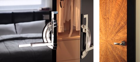
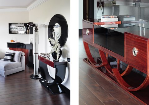
The interior doors were beautifully crafted, featuring an imbuia pomele veneer arranged in a starburst pattern radiating from the center of the door leaf.
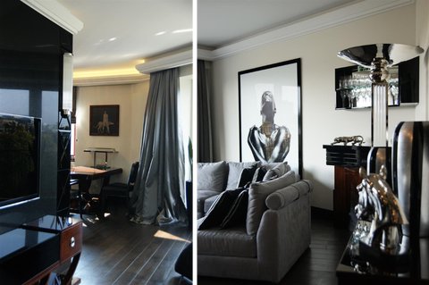
The baseboards and door casings formed a simple black strip emphasizing the lines of the doors and walls.
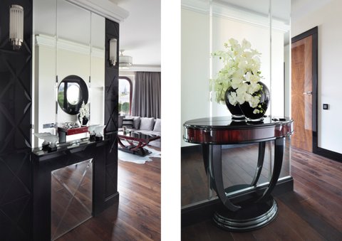
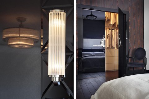
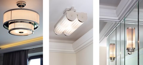
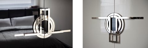
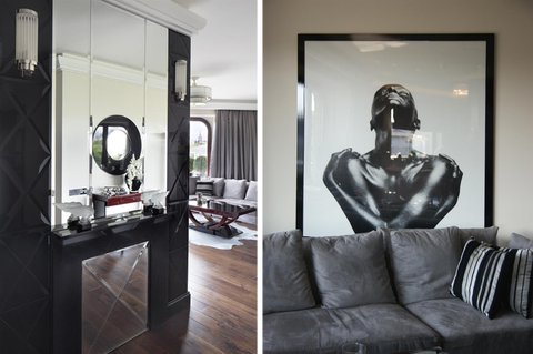
The stonemason received a design for the fireplace surround, which served as both a console and a decorative element in the hallway. The entire wall formed a composition of cut glass, mirrors, and stone, all highlighted by stylish vertical sconces made of glass tubes.
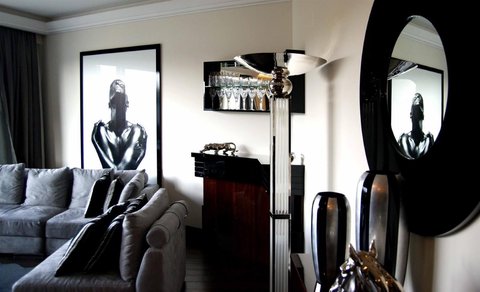
All the furniture was custom-made, with designs referencing pieces from the era. Some lamps were original specimens from the 1930s, while others were crafted by a specialized workshop.
Every element of this interior, including bed linens, kitchenware, plates, and even the sugar bowl, was carefully selected and curated.
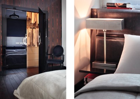
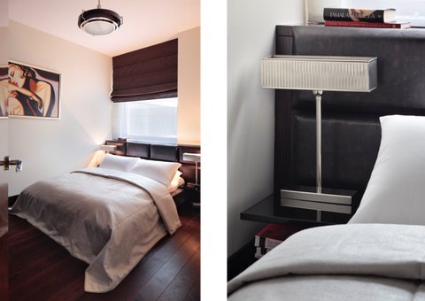
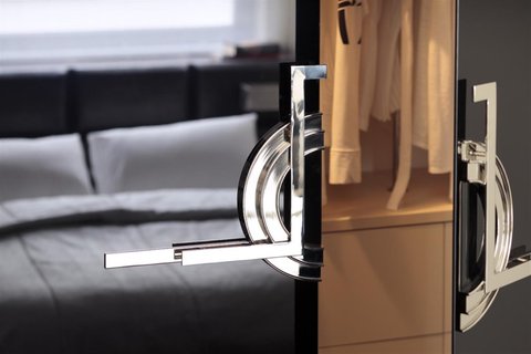
One of the most eye-catching details in these interiors is the nickel-plated door handles. I believe that using smooth fronts with such a striking decorative element was a highly successful design choice.
Large-format photography and artwork complete this interior. The photograph that filled the empty wall behind the sofa was found on a popular stock photography site. Printed in a large format and framed in glass with a black border, it added an edgy and contemporary touch to the space.
For the dining room, a painting of a woman with a panther was chosen, emphasizing the strong personality of the owner and fitting perfectly into the color scheme and character of the surroundings.
Photos of this project were published in Villa magazine in November 2011.